


3 design teams, including a former pro snowboarder, and the journey to evolving the new Salomon logo.
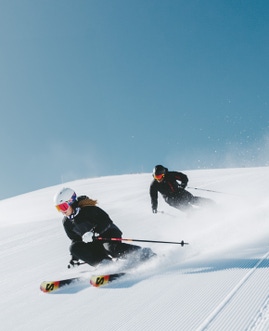
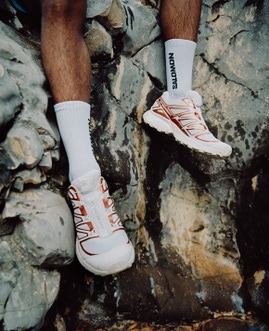
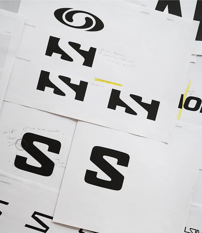
Salomon’s familiar “S” monogram and brand logo have both evolved through the decades as they adorned the brand’s iconic winter sports equipment (skis, snowboards, boots), running and hiking footwear, and technical apparel and gear. As part of the “Tomorrow is Yours” brand relaunch, a new version of the “S” monogram and a new “Salomon” logo font have been designed by a group that included an internal design team, as well as two external teams—one led by former Salomon Snowboard icon David Benedek and Ricardo Ferrol, a Swiss typographist; the other by Hugo Hoppmann, a German creative director.
This new visual identity is a great manifestation of our brand relaunch and true to our brand history and personality. The final design feels so natural and obvious, it is the best result the design team could hope for!

David Farcot
Creative Director for Salomon Snow Sports
“This new visual identity is a great manifestation of our brand relaunch and true to our brand history and personality,” said David Farcot, Creative Director for Salomon Snow Sports, who led the visual identity project. “The final design feels so natural and obvious that it may not be extremely noticeable to some people, but that is actually the best result the design team could hope for.”
The new “S” monogram and the new “Salomon” logo appear on Salomon products starting this Fall/Winter 2022-23 season. Both were unveiled discretely in the exclusive Blue Fire Collection that launched in January 2022. Attentive fans might have noticed the design on Salomon skis and snowboards at the Beijing Winter Olympics. To create the new logo in time for the January 2022 reveal, the combined teams began hurriedly in January 2021, working simultaneously and in full collaboration. Daily meetings for three consecutive weeks fast-tracked the design process as the groups explored options, shared feedback, and made decisions in real time.
“Our internal graphic designers had already worked on the ‘Salomon’ logo blueprint and were actually creating new products while participating in the logo creation with the external teams, so every new logo option was integrated into product design,” Farcot explained. “This gave us a very good idea of the impact and quality of each option for footwear, apparel, equipment, and marketing communications needs.”
Benedek, a Salomon Snowboard team rider for 18 years, today runs a creative consultancy in Munich. He was one of the most well-known riders of his era, bursting onto the snowboard scene in the early 2000s by showcasing a rare combination of style and technical tricks. Benedek’s segment in the 2002 snowboard film Afterbang by Robotfood played a significant role in the progression of snowboard films and the overall culture of the sport.
The new Salomon logo is a subtle tribute to the brand history, but with contemporary updates. To begin the project, Salomon identified what it felt were its strongest heritage markers among several logo iterations from its 75-year history—a “homemade” version from the 1970s (as Salomon became a global brand) and another from 1996 by star designer Neville Brody as Salomon explored the “Freedom Action Sports” arena.
“Salomon had a very precise brief, so we took those two logos as inspiration,” says Benedek. “The internal team did the most thorough baseline work I’ve ever seen. There was so much good strategy and analysis of various logo types and where they wanted to go, and that set up a narrow pathway for us which was very helpful.”
Farcot admits that it’s not common to work in a collaborative manner for graphic design projects. It requires a high level of trust and transparency, and for designers to put egos aside in favor of the success of the brand project. In this case, files moved seamlessly between internal designers, Hoppmann and Benedek.
“Hugo came up with the best draft version of the brandmark, and then David and Ricardo turned it into a perfectly finalized logo,” Farcot said. “Then they Created the ‘S’ monogram from this base, which Hugo used to create our new S/LAB logo and the Salomon Advanced signature.”
There was so much good strategy and analysis of various logo types and where they wanted to go, and that set up a narrow pathway for us which was very helpful!

David Benedek
Designer

We wanted to modernize the logo with stable, contemporary design trends without running people away from the brand. It’s almost an invisible re-brand in a way!

David Benedek
Designer
The design experience was unique for Benedek due to his connection with Salomon and because he felt he was working with friends.
“It was emotional to connect to a time of my life as a snowboarder that was very important and unique,” he said. “Then, from a design standpoint, there is hardly a brand that I work with that I know so well. I have a good grasp on the core of the brand and what the brand could be and what it can’t be, so that probably helped push us toward a logo and font that is authentic to the brand and a good place to be moving forward.”

Farcot believes that the new brandmark is a manifestation of Salomon’s design ethos—to be superior in function, with a very readable and recognizable sign; to be radical in design, with a very straightforward and simple aesthetic; and to be obsessive in style, with an extreme level of graphic refinement.
“David and Ricardo agonized over every radius, spacing, thickness and angle to make it absolutely perfect,” Farcot said.
From Benedek’s perspective, it was a good group effort overall.
“I wouldn’t say we melded the logos from the ’70s and ’96, but we fused the character of the S and the M and moved things to make a connection to what feels like the brand,” he said. We wanted to modernize the logo with stable, contemporary design trends without running people away from the brand. It’s almost an invisible re-brand in a way. It’s authentic and I feel like it touches the character of Salomon.”
Hoppmann is thrilled to have played a part in writing another new chapter in Salomon’s history.
“Diving into its rich brand history and designing the new Salomon logo has been a tremendously inspiring, full-circle experience for me,” Hoppmann said. “Drawing, concepting, tinkering on details, and closely collaborating with Ric, David and the rest of the amazing team has been a fantastic ride. I am deeply grateful for having been given the opportunity to make my mark on the future of Salomon.”


