


In the back corner of Salomon’s Footwear Department in Annecy, France, by a large window that looks out through some trees at the towering Alps, Amelie Fanzone is sifting through color palettes and shoe drawings. Her desk is awash in designer-type items that wreak of creativity—drawings, magazine clippings, inspirational photos. Amelie’s job as a Footwear Color Designer is to determine the color schemes that will make their way onto the finished products of Salomon trail running shoes you’ll find on the wall of your favorite retail shop.
When the decision-makers in Salomon’s footwear team decided to add several new “colorways” (designer speak for colors designs) of the super successful Sense Ride model of trail running shoes for the Fall 2018 season, Amelie had a new challenge in front of her. The goal of the new Sense Ride offering was to deliver the same high-performing products, but with a color scheme that is more wearable in an urban environment. In other words: less bright and easier to wear to the café or bar with your running buddies after finishing your workout.
“It’s not easy to open the boundaries of the trail running world to these new places,” says Amelie Fanzone, the Salomon Footwear Color Designer who worked on the project. “We have plenty of competitors now and everyone is doing the same bright colors in trail running. Some people want to see something new and they expect a brand like Salomon, which is the leader in the sport, to surprise them and answer their real desires. Our consumers of yesterday are not the same ones of today and tomorrow. The boundaries are more blurred now. You can live in the city, run trails, walk in the mountains or go to the bar. So people need versatility.”
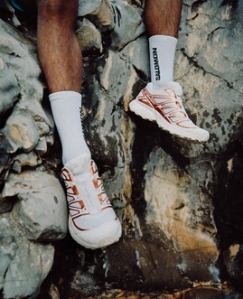
The new Sense Ride colors (available in October 2018) for men include Black/White/Phantom, White/Black/Pearl Blue and Ranger Green/White/Martini Olive. For women, they are Black/White/Phantom, White/Graphite/Pearl Blue and Potent Purple/White/Graphite. There is also an all-Black model for both men and women called the Sense Ride GTX® Invisible Fit. That model features a GORE-TEX® membrane that is integrated into the outer material instead of a traditional booty. All these models are available in both the European and North American markets.
To land on these colorways, Amelie visited retail shops, scoured the internet, watched movies and studied footwear brands that are oriented toward urban wearability. She also did in-depth studies on colors that exist in the marketplace and some that have never been used before. Using different combinations of colors and “different harmonies”, Amelie designed Sense Ride shoes in 15-20 different color combination to present to her peers in the Footwear team at Salomon. There is some constraint in that each part of a shoe can’t be done in any color she wants to use because of the materials of the shoe.
“Until now, the color was always anchored in performance, but this one is the best way to show people we can do something different,” she says. “For example, to do white shoes was a big leap for us. In the end, that’s the one people preferred because it is so different. It’s Khaki for men and Bordeaux for women.”


“We don’t want to look at other brands or even urban brands and copy them. We want to take the essence of what people are interested in and then determine how, with our Salomon brand DNA, I can transfer it to give the right answer to their demands,” says Amelie.
Though she began her career with an internship at Salomon, Amelie’s first “real job” was doing graphic design work at a Montreal advertising agency. Later, she returned to Salomon and learned color design from a former manager at Salomon who she says “taught me everything; the rational and emotional parts.” She has been in her current role for the last six years.
“Most of what I do is feeling,” she says. “Working on colors is 50 percent rational and 50 percent is instinct and emotional. It’s things you trust in and feel. Most of the time you can’t explain why.”
Still, people need proof and they need to make sense of things. So when Amelie presents her color designs to the decision-makers at Salomon, it’s important to support her decisions with inspirational photos that show this different point of view.
“There’s a balance because if you want to touch people emotionally, you don’t want to over-rationalize things,” she says. “People will feel something because you did it with passion, so there is a big side of it that is instinct.”
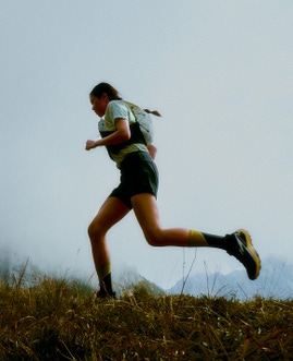
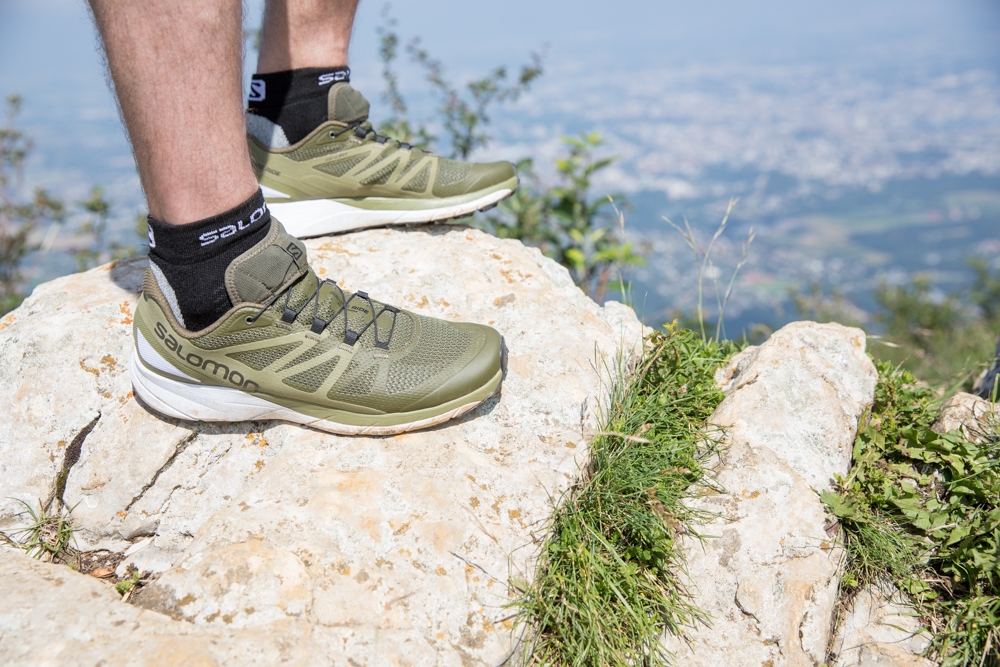
Because of Salomon’s reputation for performance, the task of delivering a new look for the Sense Ride was an aesthetic-only operation. The Sense Ride in particular has been appreciated by people new to trail running as much as it is by core trail runners. It was created with generous cushioning to make even the longest runs and the roughest surfaces comfortable. Built with a natural rocker profile, the sole and midsole of the shoe deliver a smooth ride, and the 8mm heel drop and bottom unit geometries are designed to suit the needs of a large cross-section of runners. The Premium Wet Traction Contagrip® sole on the Sense Ride is designed to offer extra grip on wet surfaces.
“The Sense Ride offers great cushioning. It rides like a road running shoe and grips like a trail shoe,” says Edouard Coyon, Salomon’s Product Line Manager for Trail Running. “It’s our most successful addition to the range in the past few years.”
As a color designer, Amelie appreciates that the performance aspect of the equation is covered.
“Performance is our first priority and we always deliver that,“ she says. “Because we don’t have to prove performance, we can take the lead and show we can bring something different, design-wise, in an effort to answer the consumer’s desires. You can wear these new colors with a pair of jeans, for instance, and we trust that today sports and lifestyle are not two different things.”


